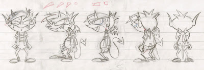
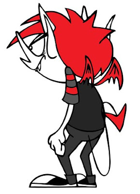
While I haven't drawn him all that much, I'm really having fun with Fink. This is actually the first time I've ever drawn him in any pose other than 3/4 profile. There were a few challenges, mostly coming from the weird shape of his head. I should have picked up some Play-Doh and sculpted a little maquette. I tried my best to get everything lined up perfectly. From the spikes of his hair, to his ears, to his nose, to his wings, to his crotch, etc etc.
I'm not too crazy about the way he looks full frontal. I don't like the shape of his head, but it lines up on the turn around.
UPDATE: I think what would make this look better is if his face were narrower. I gave his face the same width as his 3/4, which isn't really necessary.
This was the pose I started with. Classic 3/4.
I like how he looks profile!
This was a little bit tricky, but I think it looks pretty good. Interesting view.
Not too much to say about this. Pretty boring.
I think I'm going to try and make another turn around before class tomorrow. I'd like to do Fink's neglected brother, Runt. I don't draw him nearly as much as I draw Fink. His turn around should be easier because of his construction. He's made up of more simple geometric shapes. Basically a big rounded rectangle on a circle.
UPDATE: At the suggestion of Aurorah Yarberry I decided to share the original sketches.
This first set was drawn on paper. I started with the 3/4 turn (2nd from left) and used that as the base for all of the other angles. It was a pretty good start, but not everything was lined up. I needed more guides to keep everything on level.
 (click for larger)
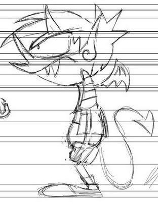
This second set was done digitally. I started again with the 3/4 pose. I used the one I had drawn above and made a lot more guide lines in Photoshop. I used my original drawings as reference, but redrew 90% of it keeping in mind to make sure everything was lined up.
 (click for larger)
There were a lot more guides actually, but because there were so many it was making things cluttered and hard to see/work. Many lines were so close to each other that they became confusing, so I just drew a few at a time and deleted them when I was done. This is actually a better idea of the amount of guides I was using.
 (click for larger)


1 comment:
When I scroll up or down fast... he is an animated turnaround.
Post a Comment