Recently, I just finished up working on the album art for Candy Coated Fury, the new upcoming studio album from everybody's favorite 3rd wave ska-punkers, Reel Big Fish
(click for larger)
This was a really fun project to work on, as I've been a fan of the group for quite a while. I never would have guessed when I first listened to them in '96 and was looking at the album art and reading the liner notes, that one day I would be the one making their art. Pretty neat. Anyway, I thought I'd share some of the concepts and process behind the album art.
First, I started with a rough concept sketch.
Once the idea was approved by the band, I started more fleshed out designs for the characters. I'm only posting the Kitten, because for the life of me, I just can't find the Bunny sketches.
Then I sketch out a final version of the characters.
After that, I bring the drawing into Adobe Illustrator and on a separate layer I draw out clean inks with the pen tool.
Finally, I export it to Adobe Photoshop to add the colors. I would like to start coloring in Illustrator, but for some reason, the Live Paint Bucket tool has been acting buggy for me. I probobly just need to sit down and run some tutorials and really learn it. In Photoshop I also comp it with the other elements like the logos, text, and background.

You can see that I also added a drop shadow. This was just to give it a little extra depth and also to give it a look that harkens back to traditional cel animation. When animation was done with cels, it was not uncommon for the camera man shooting the cels to not bother closing the glass plate over art, which would result in the celluloid lifting up from the background slightly, creating a minor shadow. These shadows have now become somewhat regarded as part of the aesthetic of traditional cel animation, and is sometimes added intentionally in some current digital productions.
I originally played around with the idea of using high contrast photos of real buildings for the cityscape in the background. Kind of like it was cut from a photocopy to give it kind of an old punk zine look.
(click for larger)
Yeah, that's not gonna work.
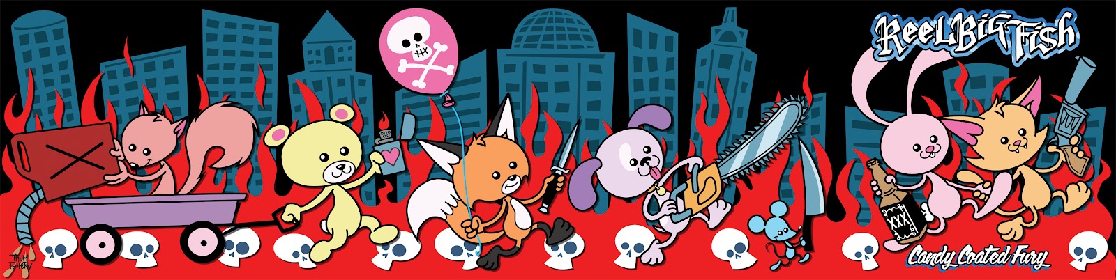
Rather than doing a booklet for the CD, the band decided on a roll-out. I liked this idea because it allowed me to make one large panoramic picture which I could use to expand on the cover.
(click for larger)
Here are some various concepts and working sketches of the rest of the ensemble of adorable friends joining in on the campaign of mayhem and destruction. You'll see in the notes that at one point I had considered giving one of the animals a crack pipe. I decided against it to keep everything at a nice PG-13 level, but I have to be honest, I think the idea of a bear or squirrel high on crack and going on a rampage is absolutely hilarious!
The colors were a bit tricky for me at first, but then I discovered it was a simple matter of the arrangement of the characters. Originally, the Fox was in front of the Puppy, but something just seemed off with the colors to me. I knew I wanted the Fox to be orange and the Bear to be yellow, but the purple Puppy in the middle just wasn't working. I tried several different colors like green and blue, but nothing looked as good on him as purple. Then I tried swapping the Fox and Puppy's positions and then the colors just seemed to click
The Mouse was a late addition. He was essentially just filler. The Puppy's placement had to be pushed to the left from the Kitten and Bunny so the blade from the chainsaw would not intrude on the cover when the roll out was folded. This created a lot of odd negative space.
I knew there wasn't enough room for a full sized character, but the space looked just big enough for a mouse. I decided to pay tribute to my all time favorite animation director, Chuck Jones, and have the mouse serve as a reference to a Looney Tune from 1948 called "Scaredy Cat". In this cartoon, Porky and a non-speaking
Sylvester move into a house that is infested with psychotic mice with a
penchant for ritualistic homicide. I had recalled an executioner mouse marching with a knife in that cartoon, so I sketched this out.
After I had drawn it out, I went to look at the cartoon for reference. I noticed that it wasn't a knife he was carrying, but rather an axe.
I had the right scene, but it turns out I was mistaking the weapon for a different scene from a similar Porky/Sylvester/homicidal mice cartoon from 1954 called "Claws For Alarm" (also directed by Chuck Jones)
I decided to leave the drawing as a mouse with a human sized knife, rather than giving him a small mouse sized axe. While I know not everything in the art is to scale, I wanted the idea to be that all of the animals props are human sized. It just seems funnier to me that a kitten would be using a people sized gun instead of a little cat sized gun.
The back cover was pretty straight forward. Originally, there weren't going to be any pictures of the band themselves in the CD, so I was going to draw caricatures of the band members wearing animal pajamas with footies and hoods, like Ralphie in "A Christmas Story" or Max in "Where The Wild Things are. It was later decided that the 4 panel roll out would open up to have an 8 panel photo poster of the band. Since there was now a picture of the band members and the deadline was bearing down, we scrapped the animal pajama idea and opted to put the Kitten and Bunny on the back to sort of book end the whole thing. I didn't even get started on the caricatures, so I don't have any concept sketches to show.
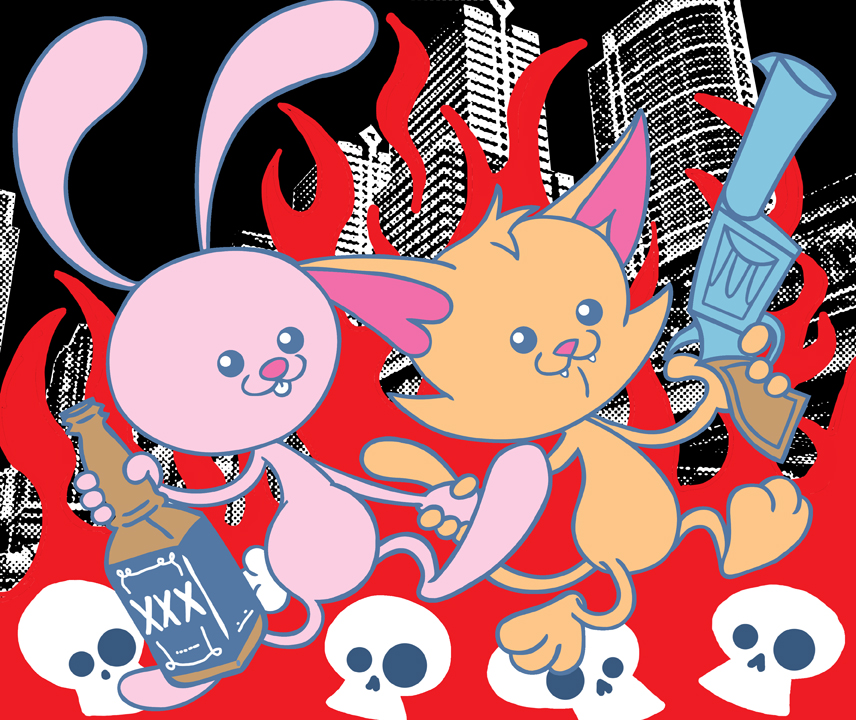
Here was the initial concept.
Then the pencil sketch. I had told Aaron (lead vocals/guitar) that they would be drinking on top of the skulls. As I was sketching though, I made the switch to ice cream and chocolate to tie into the title a bit.
(click for larger)
Aaron said he liked both ideas, so we split it. Beer for Murder Bunny and ice cream for Kitty Mayhem. Here's the final.
(click for larger)
The Bunny's beer was inspired by a Pabst Blue Ribbon can. I just wanted to go with something iconic. Had the chocolate bar remained, I would have used the colors from a Wonka Bar prop from the 1971 "Willy Wonka and the Chocolate Factory" film.
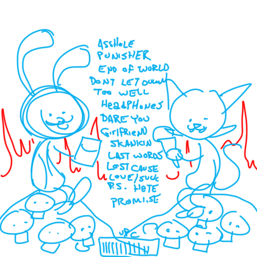
The flip side of the roll out has the lyrics and credits. At first I thought I would try a vertical panoramic since the cover side was horizontal. Here was the initial idea.
It was rightfully decided that this was a bit too dark (and I agree). I then decided to keep it as a horizontal panoramic. I played with the idea of having the animals frolicking in an enchanted forest. As if that would be the lead in to the destruction on the cover side. But that just didn't seem too funny. It didn't have any kind of a hook to it like the cover did. This is the only sketch I have from that idea.
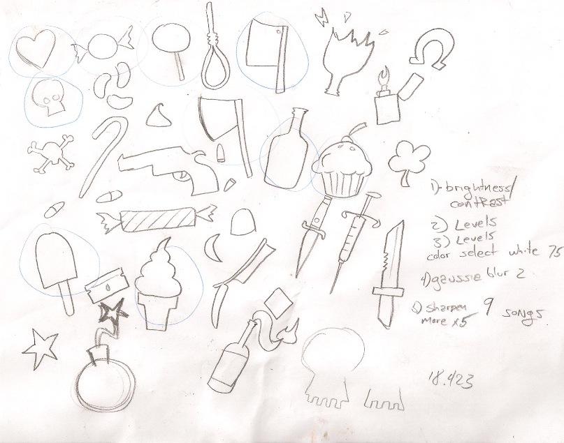
I decided on something simple since there was just so much text, there wouldn't be much room for illustration. I figured simple silhouettes of candy/sweets and icons of (cartoon) violence with the text filling the shapes would work. First I doodled various shapes. Anything iconic that would be reconizable as a silhouette.
Then, as with the other elements, brought it into Illustrator and started creating vector shapes on a separate layer. After that, I just played with shifting objects around to get everything to fit as well as possible so as to maximize space. Once I had everything fit in a way that looked good, I added colors.
(click for larger)
Finally, I duplicated all of the shapes to a separate layer and pasted the lyrics into each shape using the Area Type Tool. Each one required a little bit of finesse, but the tool did most of the heavy lifting. Here is the final. Note, I blurred out the lyrics for the web. I don't want to give anything away before the album is released. The lyrics will be legible in the actual CD package.
(click for larger)
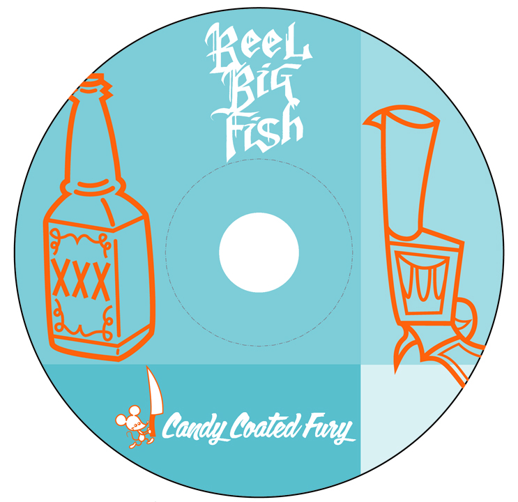
While working on this, I noticed that this would be the 2nd time a gun has appeared on an RBF album cover. The first time was on their 2nd full length, "Turn The Radio Off", from 1996 (y'know, the one with "Sell Out"). That got me thinking about the disc art from that album. It had a drawing of a gun on it.
I thought it might be a cool idea to replicate that disc art, but use the gun illustration from the cover, and use the new logo and title font. Aaron suggested adding Bunny's liquor bottle from the cover as well. I also swapped out the little fish mascot from the original for the Mouse with the knife. Here's how it turned out.
You can't tell from this picture, but the blue segments are all the same color at various transparencies and should print so that it looks like the picture of the original. Also the silver of the disc will be showing through where it appears white.
Originally, there wasn't going to be any art for the tray. But then I remembered "Pinkerton" by Weezer. The tray was the plain opaque black kind, but hidden underneath was artwork of a map. It was a little Easter Egg they threw in there and the only way to see it was to remove the plastic tray. I always thought that was a neat idea, so I thought a skeleton version of Murder Bunny and Kitty Mayhem would be rad.
Now, I know the Bunny wouldn't really have bones in his ears, but its a cartoon, and its funnier that way. After I sketched it out and was about to bring it into Illustrator to begin vector tracing, but I was feeling inspired and decided to try something a little different from my normal style. I drew the whole thing in Photoshop using the sketch as a rough guide and tried to got for kind of a Dia De Los Muertos look.
(click for larger)
In the end, we decided not to have it hidden. There will be a transparent tray that shows the art. It will be sized to be covered by the disc though, so it can only be seen when the CD is taken out of the case.
Well, that's about it. Way more information than you wanted or needed, I'm sure. I believe the album will be released in stores on July 31st, but the band should have copies available for sale on their tour this summer. I've heard it, and I can tell ya, it's pretty great! If you like RBF's earlier work, like "Turn The Radio Off", or Aaron's work in Forces Of Evil, then you're gonna love this! If you don't like ska, well then I've got some bad news for you.


