Monday, November 24, 2014

Janet in Cartoonland!

This past weekend I had the pleasure of working on a really cool project for one of my favorite musicians and dear friends, Janet Klein. I'm working on the artwork for her upcoming album, so for the inside, in keeping with the style of her music and our mutual love of vintage animation, we decided to create a vintage black and white cartoonland set.

(click for larger)

To give it an authentic 1920s animation feel, I wanted everything to be stark black and white, no grey tones. While I do realize that there were some grey tones in animation in the 1920s, it was used very very sparingly. More detailed and fully rendered backgrounds didn't really start appearing in animation until the 1930s. Also, I wanted everything to be 2D and have a forced perspective feel to it. Here's some detail shots of the set pieces and props. 


The inspiration for the concept came when Janet found this vintage 1920s photo of Alberta Vaughn.

(click for larger)

Additional inspiration for the design of the set came from one of Janet's and my favorite cartoon characters, Felix the Cat. I borrowed heavily from Ottos Messmer's work as well as Walt Disney/Ub Iwerks "Alice" cartoons on this project


Here's a few additional behind the scenes shots.


Stay tuned for cover art and liner note illustrations as we keep moving forward with the project!

Sunday, November 16, 2014

"Very Angry Indeed!"

Here's my piece for WHEN GOOD TOONS GO BAD: VILLAINS OF ANIMATION A Group Art Show at Van Eaton Galleries

(click for larger)
"Very Angry Indeed!"
18x46
acrylic on canvas

I really enjoyed painting these characters. It's always fun to do a take on characters from my hero, Chuck Jones. The background is also a nod to background designer extraordinaire, Maurice Noble. This is based on his designs from "Hare-Way to The Stars" (1958) which I believe featured some of his best design work which ranks right up there with "What's Opera, Doc?" (1957) and "Duck Dodgers in the 24½th Century" (1953)

The show was great and features a ton of great pieces by some incredible artists. You can see the all of the work online here. The opening reception was a blast as always and I dressed for the occasion.


Now you can own the candy and the fury!

Hey, kids! I'm auctioning off one of the original pencil drawing I used to create the album cover for Candy Coated Fury by Reel Big Fish.


The artwork is signed not only by myself, Thom Foolery, but also the entire band (the line up which recorded Candy Coated Fury, this includes long time member no longer with the group, Dan Reagan) The signatures are: Aaron Barrett (guitar, lead vocals), Dan Regan (trombone, vocals), John Christianson (trumpet, vocals), Ryland Steen (drums), Derek Gibbs (bass, vocals), and Matt Appleton (sax, vocals)

100% of the sale will go to benefit Toys for Tots. For more information on how the drawing was used in the production of the artwork, check out my behind the scenes blog post about the cover from 2012.

Wednesday, October 29, 2014

Look, ma! I'm on TV!

One of my paintings was featured in the background of "Drumline: A New Beat" starring Nick Cannon on VH1


The painting is from my "Cannibal Animal" series. The rest can be seen on an old blog post here.

Wednesday, October 15, 2014

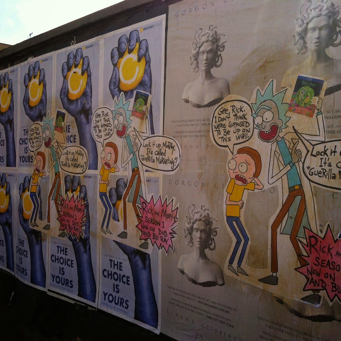
Rick and Morty "Exploit The Fans for Promotional Art Contest"!

Here's my entry for Rick and Morty's "Exploit The Fans for Promotional Art Contest"

 (click for larger)

These are paste ups I made and each was individually painted by hand. I put them up at 5:00 this morning on Hollywood Blvd at the corner of St. Andrews Pl. They're roughly 36x40. I had made 3 pieces with the intention of hitting up La Brea and Fairfax as well. But due to circumstances beyond my control (the less said, the better) I had to paste up all 3 in the same location.
Rick's exclamation of "Lock it up, Morty" is a call back to to an old Channel 101 short featuring the early prototypes of Rick and Morty named "Doc and Mharti" The video can be seen here.
Anyway, here's some additional pictures. 

(click for larger)

(click for larger)

(click for larger)

(click for larger)

 (click for larger)

 (click for larger)

(click for larger)


(click for larger)

(click for larger)

Tuesday, October 14, 2014

Catopia!

Here's a poster I recently made for The Trepany House which is one of Los Angeles's coolest theaters.

(click for larger)

This was a really fun one to draw. Prints will be available at the event and then on the Trepany House website. It suddenly dawned on me that with all of the cats I've been drawing over the past few years, will I become this century's Louis Wain? I kinda hope so. I wanna see what madness is like!

Monday, September 29, 2014

"Isn't that lovely? Hmm?"

(click for larger)
24x36
house paint and marker on canvas

Here's a speed painting of Marvin the Martian that I did this weekend for fun. The entire time spent on it from start to finish was 55 minutes. You can see the whole thing condensed down to 3 minutes here.

Thursday, September 25, 2014

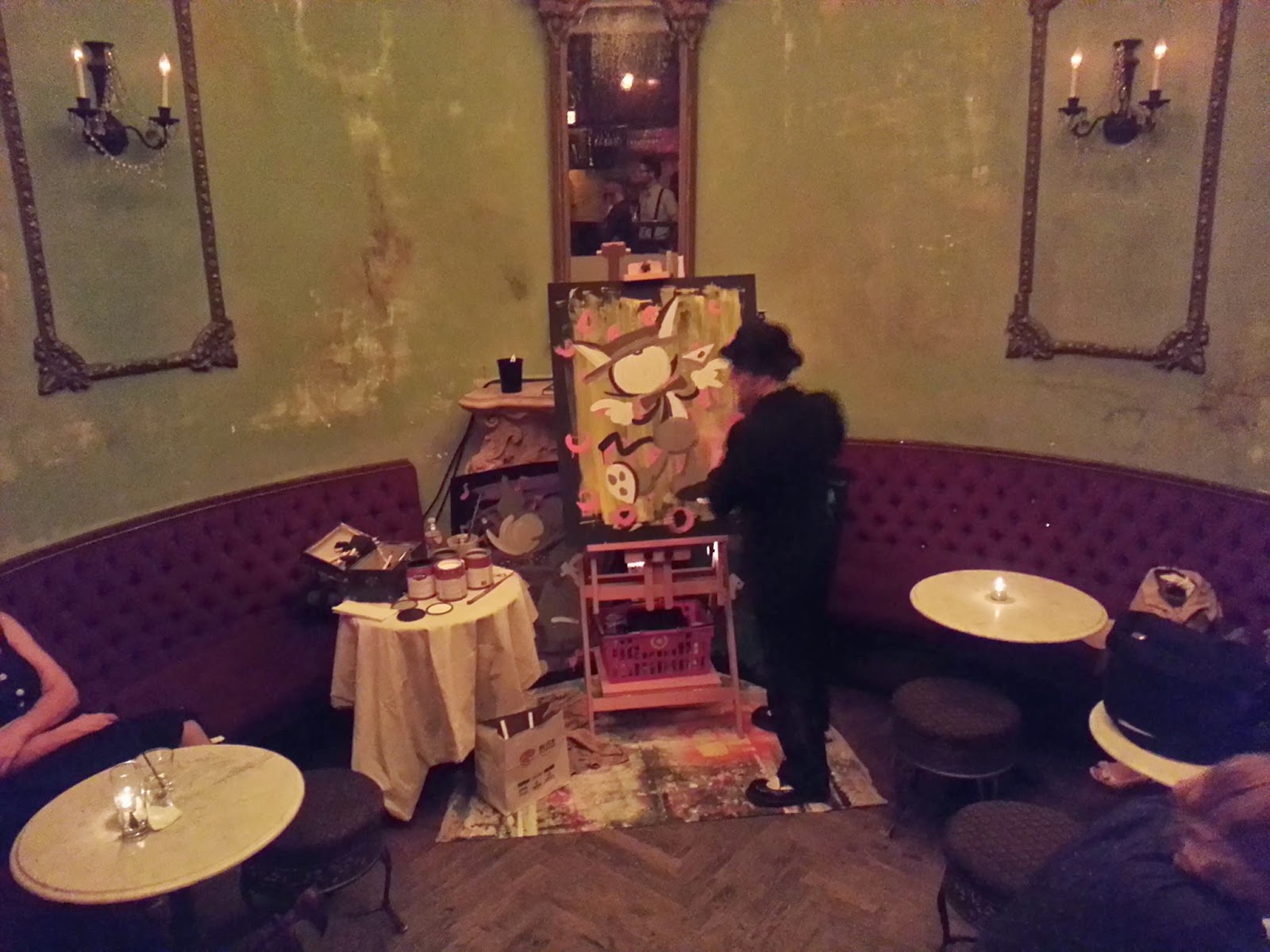
Live art from Swingtronic

Lately I've been doing live painting at Swingtronic, at Pour Vous in here in Hollywood. It's been a lot of fun so far. Swingtronic features live jazz bands, classic and electro swing DJ sets, so I've been painting cartoons in the 1930s style to keep in step with the overall theme and feel of the night. Here's a few from the past month. All of these are 32X40, house paint and marker on board.

(click for larger)

(click for larger)

 (click for larger)

 (click for larger)

 (click for larger)

Part of reason I enjoy doing live painting is the challenge for myself of allowing my work to become a bit looser and less disciplined. I want to try to let go of my inclination for perfection and over-thinking and just be a bit more spontaneous with my line work and allow mistakes to happen and just go with it. I think the paintings then take on a different energy compared to ones that I spend several hours or days on in my studio. 

At this point, I'm still sketching out the designs for what I'll paint ahead of time, but I do hope to get to the point where I can become 100% spontaneous with the live work. 


Here's a few progress/process shots


Thursday, August 28, 2014

What fresh hell is this?

(click for larger)

This is a just a quick doodle I made after my friend, Stormy, posted a picture of Cat Head brand pumpkin spice flavored vodka. This is the image that immediately came to mind

Crazy 8s!

(click for larger)

Hey, Kids! How you like like a vinyl die cut sticker of this friendly octopus drawn by yours truly? Well, it can be yours along with ANOTHER sticker of your choice by a far more talented artist for the low low price of just $5! Wow! Whatta deal! How can you obtain such adhesive beauty? Simply by throwing $5 the Kickstarter campaign of my good friend and incredible artist, Kaity O'Shea. She is the genius behind Killer Tentacle Octopus and she needs your help to begin mass production on her newest masterpiece. So don't delay! Buy a damn sticker today!!
https://www.kickstarter.com/projects/kto/tentacle-crown

Saturday, August 16, 2014

"Oh, I think I'm in love!"

 (click for larger)

This is my piece for "Meatball Head: An Art Show Celebrating 20 Years of Sailor Moon" opening tonight at Meltdown Comics It's a hand painted animation cel. Here's some detail shots.

 (click for larger)

(click for larger)

(click for larger)

I've always loved collecting animation art, so it's really fun to get to create my own. It is difficult however because I'm not using the correct paints. Cel Vinyl paint is really the only paint to use, but it's really expensive and since cels aren't actually used in animation production anymore, there's only one company that makes it anymore. Since I don't have any, I have to use heavy body acrylics. This piece was more challenging that my cel for the Wes Anderson tribute show because it has much more detail. I discovered that latex house paint and mixing my acrylic with gesso seemed to help the flow of the paint somewhat. Here's some progress pics.

 (click for larger)

(click for larger)

(click for larger)

(click for larger)

(click for larger)

My line art which I drew digitally was photocopied onto the cel and I painted the reverse side. Here is my original digital drawing and color key. 

(click for larger)

The background was created digitally and just printed. I was originally going to hand paint the background, but I wasn't sure how to create the circles/bubbles without an airbursh (which I don't have). I was watching a lot of Sailor Moon episodes as research for the painting, and boy, do they sure like to throw those bubble in A LOT of backgrounds. Here's the background itself.


I based this off of one of the background from the opening title sequence.


If you're in the Los Angeles area, come out to the show tonight. It was curated by my pal Nico Colaleo and he puts together some great shows with absolutely incredible artists. I saw some of the work last night and it blew me away!